Unveiling the power of colors: Exploring how hues shape emotions and ambiance.
The Influence of Warm Colors on Emotions and Energy Levels
Color Psychology: How Hues Impact Mood and Atmosphere
The Influence of Warm Colors on Emotions and Energy Levels
Color has a profound impact on our emotions and energy levels. Warm colors, such as red, orange, and yellow, are known to evoke strong emotions and increase energy levels. Understanding the influence of warm colors can help us create the desired mood and atmosphere in our surroundings.
Red, the color of passion and power, is known to stimulate the senses and increase heart rate. It is often associated with strong emotions such as love, anger, and excitement. In interior design, red can be used strategically to create a sense of urgency or to draw attention to a particular area. However, it is important to use red sparingly, as too much of it can be overwhelming and even provoke feelings of aggression.
Orange, a vibrant and energetic color, is often associated with enthusiasm and creativity. It is known to stimulate mental activity and increase social interaction. In interior design, orange can be used to create a welcoming and lively atmosphere, making it a popular choice for restaurants and social spaces. However, like red, orange should be used in moderation to avoid overwhelming the senses.
Yellow, the color of sunshine and happiness, is known to evoke feelings of joy and optimism. It is often associated with mental clarity and increased focus. In interior design, yellow can be used to create a cheerful and uplifting atmosphere, making it a great choice for kitchens and workspaces. However, it is important to choose the right shade of yellow, as bright yellows can be too stimulating and cause feelings of anxiety.
The influence of warm colors on emotions and energy levels extends beyond interior design. In marketing and advertising, warm colors are often used to grab attention and create a sense of urgency. For example, many fast-food chains use red and yellow in their logos and signage to stimulate appetite and encourage quick decision-making. Similarly, warm colors are often used in sports and fitness branding to convey energy and motivation.
It is worth noting that the impact of warm colors can vary depending on cultural and personal associations. For example, in Western cultures, red is often associated with love and passion, while in some Eastern cultures, it is associated with luck and prosperity. Similarly, personal experiences and preferences can influence how individuals respond to warm colors. Some people may find red energizing and exciting, while others may find it overwhelming or even anxiety-inducing.
In conclusion, warm colors have a significant influence on our emotions and energy levels. Red, orange, and yellow are known to evoke strong emotions and increase energy. When used strategically, warm colors can create the desired mood and atmosphere in our surroundings. However, it is important to use warm colors in moderation and consider cultural and personal associations to ensure a positive and harmonious effect. By understanding the psychology of color, we can harness its power to enhance our well-being and create spaces that evoke the desired emotions and energy levels.
Exploring the Calming Effects of Cool Colors on the Mind
Color Psychology: How Hues Impact Mood and Atmosphere
Exploring the Calming Effects of Cool Colors on the Mind
Color has a profound impact on our emotions and can significantly influence our mood and the atmosphere of a space. Understanding the psychology behind different colors can help us create environments that evoke specific feelings and emotions. In this article, we will delve into the calming effects of cool colors on the mind.
Cool colors, such as blue, green, and purple, are known for their ability to create a sense of tranquility and relaxation. These colors are often associated with nature, water, and the sky, which may explain their soothing effects on the mind. Blue, in particular, is known to promote feelings of calmness and serenity. It has been found to lower blood pressure and heart rate, making it an ideal color for spaces where relaxation is desired, such as bedrooms or meditation rooms.
Green, on the other hand, is often associated with nature and symbolizes growth and renewal. It has a calming effect on the mind and is believed to reduce anxiety and stress. Research has shown that exposure to green environments can improve mood and increase feelings of relaxation. Incorporating green into interior design can be achieved through the use of plants, natural materials, or even green-colored walls.
Purple, a color often associated with royalty and luxury, also has calming properties. It is believed to stimulate creativity and promote a sense of spirituality. Lighter shades of purple, such as lavender, can create a serene and peaceful atmosphere, while darker shades can add a touch of elegance and sophistication to a space. Purple is often used in bedrooms and meditation rooms to create a sense of tranquility and promote restful sleep.
When using cool colors to create a calming atmosphere, it is important to consider the intensity and saturation of the colors. Lighter shades of blue, green, and purple tend to have a more soothing effect, while darker shades can create a more dramatic and intense atmosphere. It is also essential to consider the balance between cool and warm colors in a space. While cool colors promote relaxation, too much of them can create a cold and unwelcoming environment. Combining cool colors with warm neutrals or accents can help create a balanced and inviting atmosphere.
In addition to the color itself, the way it is used in a space can also impact its calming effects. The use of soft and muted tones can enhance the soothing properties of cool colors. Avoiding harsh contrasts and opting for a more monochromatic color scheme can create a sense of harmony and tranquility. Natural light is also crucial in creating a calming atmosphere. Allowing ample natural light to enter a space can enhance the soothing effects of cool colors and create a connection to the outdoors.
In conclusion, cool colors have a significant impact on our mood and the atmosphere of a space. Blue, green, and purple are known for their calming effects on the mind, promoting relaxation and tranquility. When using cool colors, it is important to consider the intensity, balance, and use of natural light in a space. By understanding the psychology behind color, we can create environments that promote well-being and enhance our overall sense of calmness.
The Psychological Impact of Color Combinations in Interior Design
The use of color in interior design goes beyond mere aesthetics. It has the power to evoke emotions, influence moods, and create a specific atmosphere within a space. Understanding the psychological impact of color combinations is crucial for interior designers, as it allows them to create spaces that not only look visually appealing but also have a positive impact on the occupants.
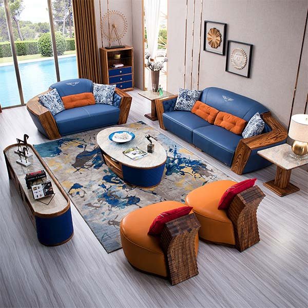
Color combinations play a significant role in determining the overall mood of a room. Warm colors, such as red, orange, and yellow, are known to create a sense of energy and excitement. These colors are often used in spaces where social interaction is encouraged, such as living rooms or dining areas. On the other hand, cool colors like blue, green, and purple have a calming effect and are often used in bedrooms or spaces where relaxation is the primary goal.
The way colors interact with each other can also affect the atmosphere of a room. Complementary colors, which are opposite each other on the color wheel, create a vibrant and dynamic atmosphere. For example, pairing blue with orange or red with green can create a visually striking and energetic space. Analogous colors, which are adjacent to each other on the color wheel, create a more harmonious and soothing atmosphere. Combining shades of blue and green, or yellow and orange, can create a sense of unity and balance in a room.
Contrast is another important aspect of color combinations in interior design. High contrast color combinations, such as black and white or navy blue and yellow, create a bold and dramatic effect. This can be used to draw attention to specific elements in a room or create a focal point. On the other hand, low contrast color combinations, such as different shades of the same color, create a more subtle and sophisticated atmosphere. This can be particularly effective in creating a sense of depth and dimension in a space.
In addition to the overall mood and atmosphere, color combinations can also have a psychological impact on individuals. Certain colors have been found to evoke specific emotions and feelings. For example, red is often associated with passion and energy, while blue is associated with calmness and tranquility. By strategically using these colors in interior design, designers can create spaces that elicit the desired emotional response from the occupants.
It is important to note that individual preferences and cultural backgrounds can also influence the psychological impact of color combinations. While certain colors may have universal associations, such as red with danger or green with nature, personal experiences and cultural norms can shape how individuals perceive and respond to different colors. Therefore, it is essential for interior designers to consider the specific context and target audience when selecting color combinations for a space.
In conclusion, the psychological impact of color combinations in interior design is a crucial aspect that should not be overlooked. By understanding how different colors interact with each other and the emotions they evoke, designers can create spaces that not only look visually appealing but also have a positive impact on the occupants. Whether it is creating a vibrant and energetic atmosphere or a calm and soothing environment, color combinations play a significant role in shaping the mood and atmosphere of a room.
Conclusion
In conclusion, color psychology suggests that different hues can have a significant impact on mood and atmosphere. Warm colors like red and yellow tend to evoke feelings of energy and excitement, while cool colors like blue and green are often associated with calmness and relaxation. Additionally, certain colors may have cultural or personal associations that can influence emotions. Understanding the psychological effects of colors can be valuable in various settings, such as interior design, marketing, and therapy, as it allows for intentional use of colors to create desired moods and atmospheres.