Bold Color Blocking: Making a Statement with Colorful Design
The Impact of Bold Color Blocking in Graphic Design
Bold Color Blocking: Making a Statement with Colorful Design
Color is a powerful tool in the world of graphic design. It has the ability to evoke emotions, convey messages, and create a visual impact. One technique that has gained popularity in recent years is bold color blocking. This technique involves using contrasting colors in large, solid blocks to create a striking visual effect. In this article, we will explore the impact of bold color blocking in graphic design and how it can be used to make a statement.
Bold color blocking is all about creating contrast. By using colors that are opposite each other on the color wheel, designers can create a dynamic and eye-catching composition. This technique is particularly effective in grabbing the viewer’s attention and making a strong visual statement. The use of bold, contrasting colors can create a sense of energy and excitement, making the design stand out from the crowd.
One of the key advantages of bold color blocking is its versatility. It can be used in a variety of design projects, from posters and advertisements to websites and logos. The technique can be applied to both digital and print media, allowing designers to experiment and push the boundaries of their creativity. Whether it’s a minimalist design with just a few colors or a more complex composition with multiple blocks, bold color blocking can add a unique and memorable touch to any project.
Another benefit of bold color blocking is its ability to convey meaning and evoke emotions. Different colors have different associations and can elicit specific reactions from viewers. For example, red is often associated with passion and energy, while blue is often associated with calmness and trust. By strategically choosing colors and arranging them in bold blocks, designers can create a visual language that communicates a specific message or feeling. This can be particularly useful in branding and advertising, where the goal is to create a strong and memorable impression.
In addition to its visual impact, bold color blocking can also improve the usability and accessibility of a design. By using contrasting colors, designers can create clear visual hierarchies and guide the viewer’s attention to important elements. This can make the design more user-friendly and help convey information more effectively. Furthermore, bold color blocking can also enhance the accessibility of a design for people with color vision deficiencies. By using high-contrast colors, designers can ensure that the content is easily distinguishable and readable for everyone.
While bold color blocking can be a powerful design technique, it is important to use it judiciously. Too much color or poorly chosen combinations can overwhelm the viewer and detract from the intended message. It is important to consider the context and purpose of the design and choose colors that align with the desired outcome. Additionally, it is important to ensure that the design remains cohesive and balanced, even with the use of bold color blocking. This can be achieved by carefully considering the placement and size of the color blocks and by using other design elements, such as typography and imagery, to create a harmonious composition.
In conclusion, bold color blocking is a technique that can make a strong visual statement in graphic design. By using contrasting colors in large, solid blocks, designers can create a striking and memorable composition. This technique can be used in a variety of design projects and has the ability to convey meaning, evoke emotions, and improve usability. However, it is important to use bold color blocking judiciously and consider the context and purpose of the design. With careful consideration and thoughtful execution, bold color blocking can elevate a design and make it truly stand out.
Exploring the Psychology of Color in Bold Color Blocking
Bold Color Blocking: Making a Statement with Colorful Design
Color has a profound impact on our emotions and perceptions. It can evoke feelings of joy, excitement, and even calmness. In the world of design, color plays a crucial role in creating visual interest and conveying messages. One design technique that has gained popularity in recent years is bold color blocking. This technique involves using contrasting colors in large, solid blocks to create a striking visual impact. In this section, we will explore the psychology of color in bold color blocking and how it can be used to make a statement.
Color psychology is the study of how colors affect human behavior and emotions. Different colors have different meanings and can elicit specific responses from viewers. When it comes to bold color blocking, the choice of colors is crucial in conveying the desired message. For example, red is often associated with passion and energy, while blue is associated with calmness and trust. By strategically combining these colors in bold blocks, designers can create a visual representation of these emotions.
One of the key benefits of bold color blocking is its ability to grab attention. When contrasting colors are used in large blocks, they create a visual contrast that is hard to ignore. This can be particularly effective in advertising and branding, where the goal is to capture the viewer’s attention and leave a lasting impression. By using bold color blocking, designers can ensure that their message stands out in a crowded marketplace.
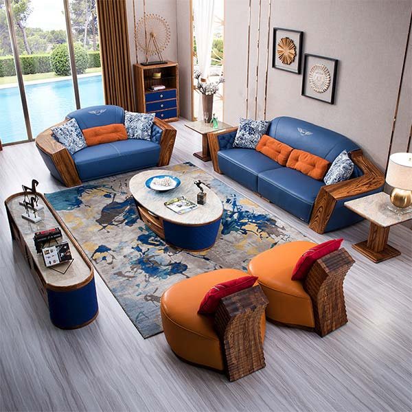
Bold color blocking can also be used to create a sense of balance and harmony in a design. By carefully selecting colors that complement each other, designers can create a visually pleasing composition. For example, using complementary colors, such as orange and blue, can create a sense of harmony and balance. This can be particularly effective in interior design, where bold color blocking can be used to create focal points and define different areas within a space.
In addition to creating visual interest, bold color blocking can also evoke specific emotions and moods. For example, using warm colors, such as red and yellow, can create a sense of energy and excitement. On the other hand, using cool colors, such as blue and green, can create a sense of calmness and relaxation. By understanding the psychology of color, designers can use bold color blocking to create a specific atmosphere or mood in a design.
When using bold color blocking, it is important to consider the context in which the design will be used. Different colors have different cultural and social meanings, and these meanings can vary across different contexts. For example, while red is often associated with passion and energy in Western cultures, it is also associated with luck and prosperity in some Asian cultures. By considering the cultural and social connotations of different colors, designers can ensure that their bold color blocking is appropriate and effective.
In conclusion, bold color blocking is a powerful design technique that can make a statement and leave a lasting impression. By understanding the psychology of color and carefully selecting contrasting colors, designers can create visually striking compositions that evoke specific emotions and moods. Whether used in advertising, branding, or interior design, bold color blocking has the potential to captivate viewers and convey powerful messages. So, next time you want to make a statement with your design, consider incorporating bold color blocking and let the colors speak for themselves.
Bold Color Blocking: Tips and Techniques for Eye-Catching Designs
Bold Color Blocking: Making a Statement with Colorful Design
Color is a powerful tool in design. It has the ability to evoke emotions, create moods, and capture attention. One technique that has gained popularity in recent years is bold color blocking. This technique involves using contrasting colors in large, solid blocks to create eye-catching designs. Whether you’re designing a website, creating a poster, or decorating a room, bold color blocking can help you make a statement.
One of the key benefits of bold color blocking is its ability to grab attention. By using contrasting colors, you can create a visual impact that is hard to ignore. When done right, bold color blocking can draw the viewer’s eye to specific elements of your design, helping to communicate your message effectively. Whether you want to highlight a call-to-action button on a website or emphasize a headline on a poster, bold color blocking can help you achieve your goal.
To create a successful bold color blocking design, it’s important to choose the right colors. Contrasting colors, such as red and green or blue and orange, work well for this technique. These combinations create a strong visual contrast that immediately catches the eye. However, it’s important to consider the context and purpose of your design. For example, if you’re designing a website for a healthcare company, using red and green might not be the best choice, as these colors are often associated with stop signs and traffic lights. Instead, you might opt for a combination of blue and orange, which are often associated with trust and energy.
Another important consideration when using bold color blocking is the size and placement of the color blocks. The size of the blocks can vary depending on the overall design and the message you want to convey. Larger blocks tend to create a more dramatic effect, while smaller blocks can be used to add pops of color or create a sense of movement. Placement is also crucial. You want to strategically place the color blocks to guide the viewer’s eye and create a sense of balance. For example, if you’re designing a website, you might use a large color block at the top of the page to draw attention to the logo or headline, and smaller blocks throughout the page to highlight important information or features.
When using bold color blocking, it’s important to remember that less is often more. While it can be tempting to use multiple colors and large blocks throughout your design, this can quickly become overwhelming and chaotic. Instead, focus on using a few key colors and strategically placing the blocks to create a cohesive and visually pleasing design. This will help ensure that your message is clear and your design is easy to understand.
In conclusion, bold color blocking is a powerful technique that can help you make a statement with your designs. By using contrasting colors in large, solid blocks, you can create eye-catching designs that grab attention and communicate your message effectively. Remember to choose the right colors, consider the size and placement of the blocks, and keep your design cohesive and balanced. With these tips and techniques, you’ll be well on your way to creating bold and impactful designs that leave a lasting impression.
Conclusion
Bold color blocking is a design technique that involves using contrasting colors in large, solid blocks to create a visually striking effect. It is a powerful way to make a statement and grab attention in various design fields, including fashion, graphic design, and interior design. By combining vibrant hues and sharp contrasts, bold color blocking can evoke emotions, convey messages, and create a sense of energy and dynamism. Whether it’s through clothing, artwork, or interior spaces, this design approach allows for endless possibilities and encourages creativity. Bold color blocking is a bold and impactful choice that can transform any design into a visually captivating and memorable experience.